
Chocolate Brand & Visual Identity
The Challenge
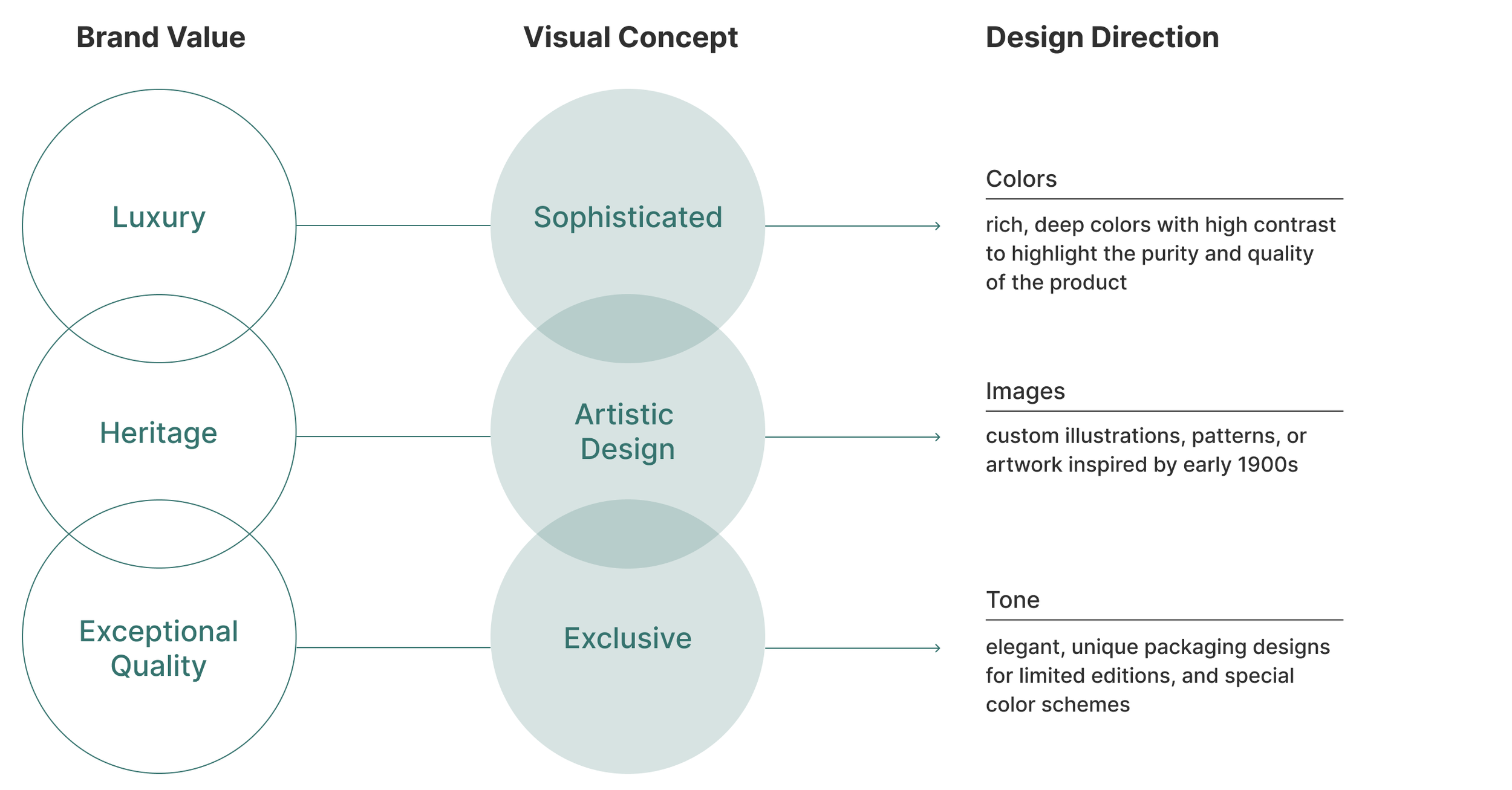
To position Golden Cacao as a premium artisanal leader in a saturated market. The goal was to bridge "Old World" luxury with a modern, scalable design system.
The Strategy
I leveraged an Art Nouveau visual language to build immediate "Heritage Trust," creating a design system that justifies a premium price point while remaining production-ready.
My Role
Brand Guideline Design | Package Design

Design Approach
Inspired by Cacau de Ouro’s 1920s Brazilian heritage, I designed a brand identity rooted in the Art Nouveau era. I selected an illustration of a woman as the focal point, embodying elegance and tradition. Extending this aesthetic across packaging and marketing materials, I created a cohesive design system that honors the brand’s legacy while appealing to modern consumers.

Color Selection
The color palette has been created to based on three areas and was used extensively from print to digital materials to streamline its identity.

Typefaces Selection
The typefaces have been chosen to feature an Art Nouveau style for headlines, paired with a complementary font for regular text to ensure a cohesive and visually appealing design.
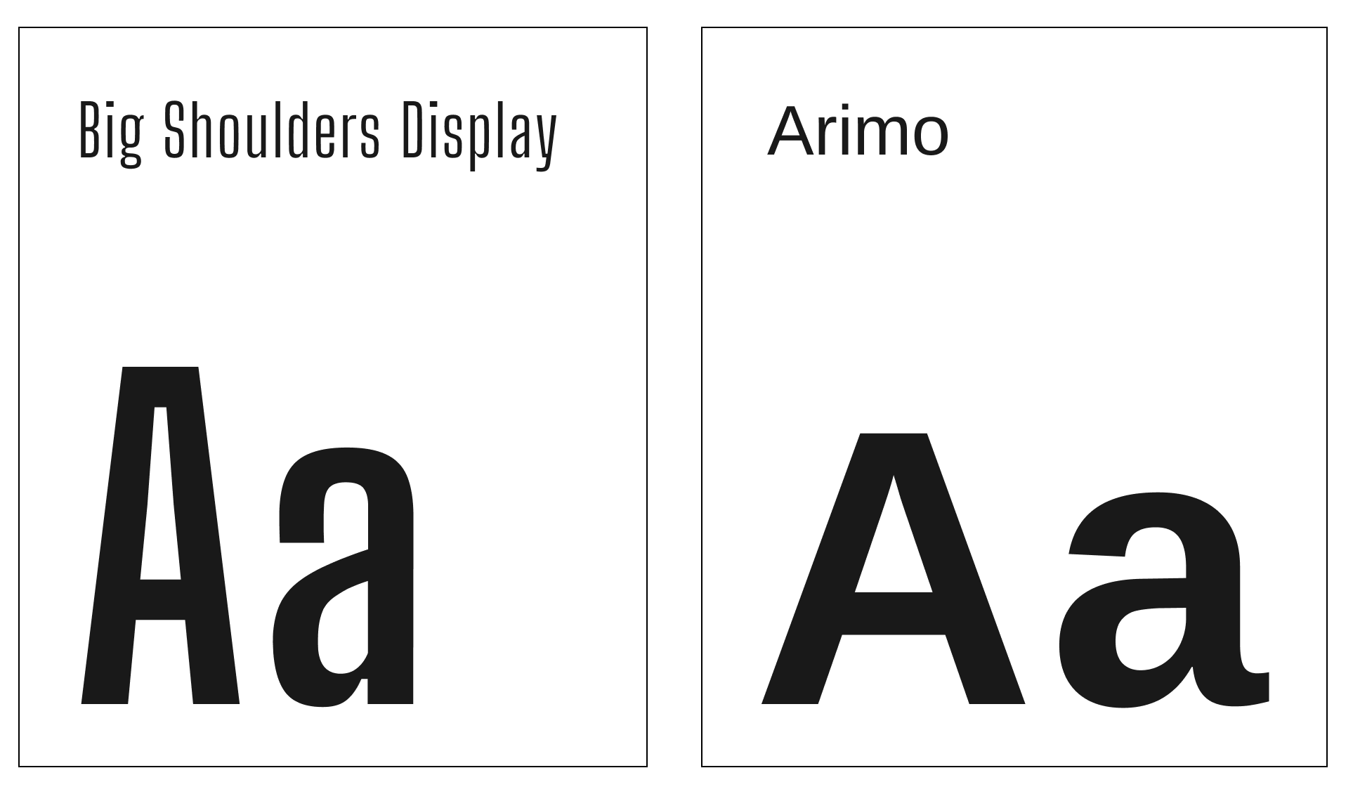
Image Selection
The image palette has been carefully crafted to encompass three key areas, perfectly reflecting both the brand identity and its unique style.


Social Media Design

