
Investor Fundraising Materials
A global cable and energy infrastructure company engaged a leading investment bank’s Capital Solutions team to support a fundraising process and investor outreach.
The Challenge
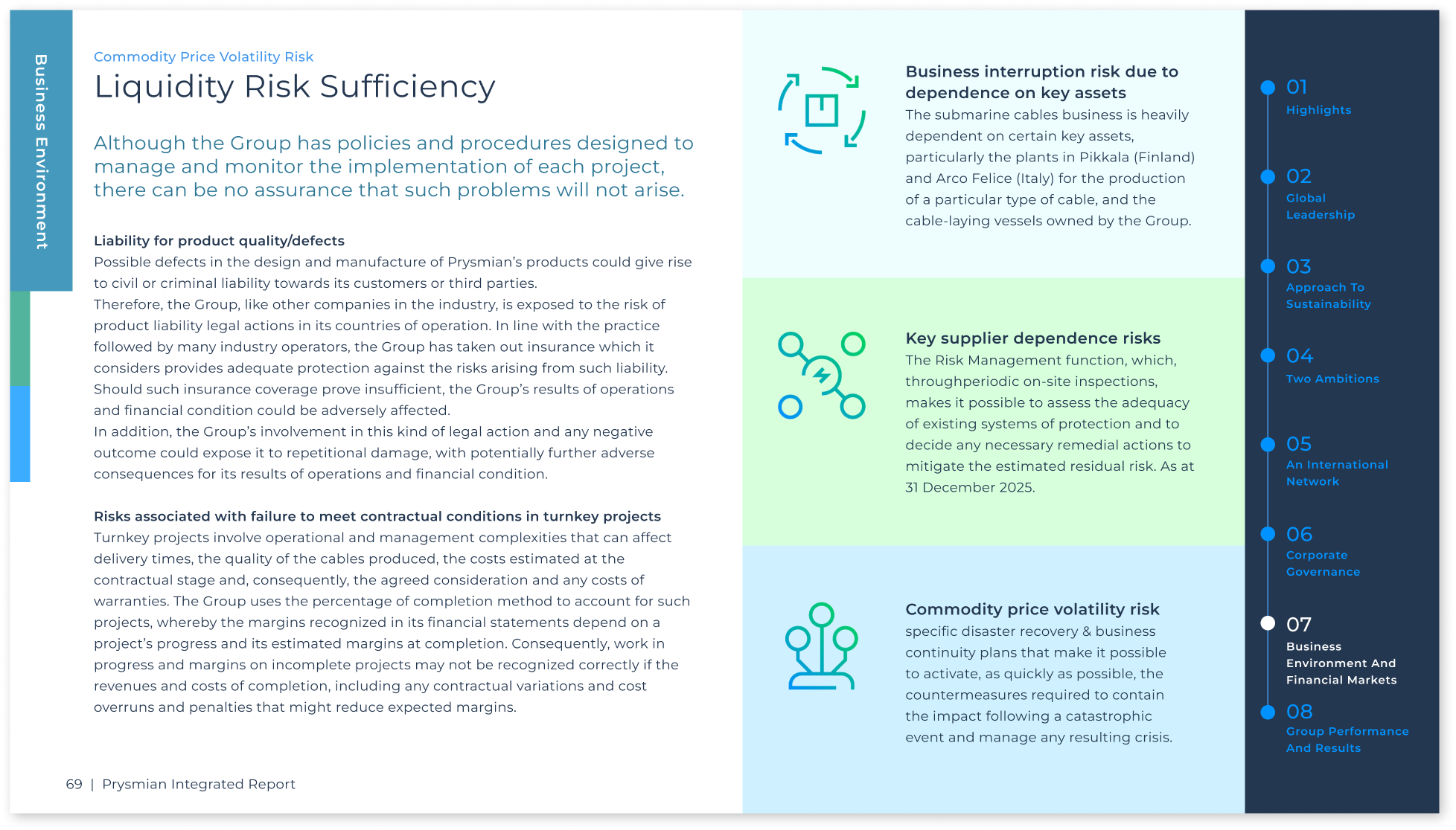
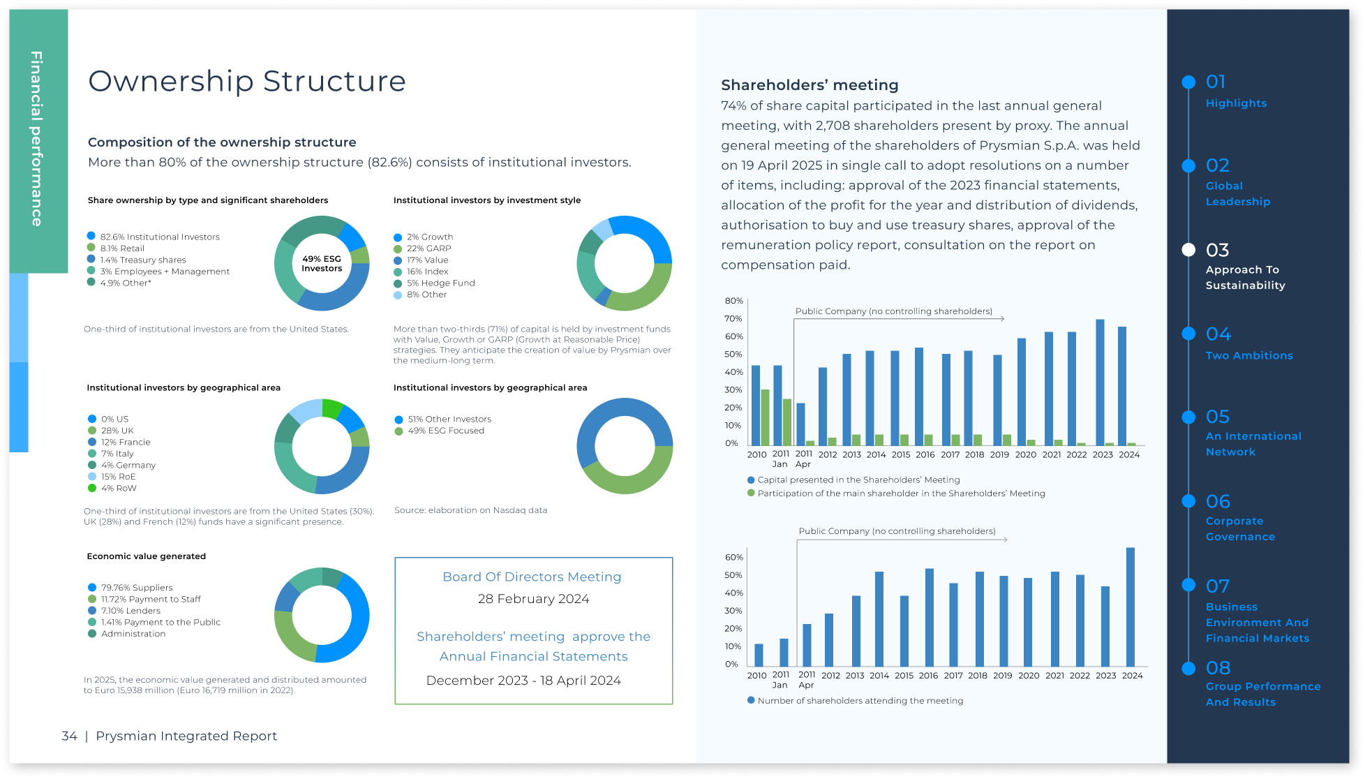
The primary challenge was to transform a massive 180-slide Investor Report into a high-performance communication tool. The project required a balance between granular financial transparency and a seamless user experience. With such a high volume of information, the risk of "investor fatigue" was high. My goal was to architect a system that felt intuitive, professional, and allowed for rapid data retrieval during high-stakes due diligence.
My Role
Presentation Design | Visual Systems | Data Visualization | Interactive PDF Design
Team
Corporate Finance Advisory Team | Client Executive Stakeholders
The Solution: A Non-Linear Navigation Framework
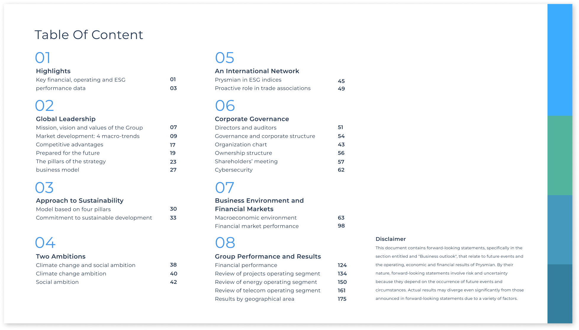
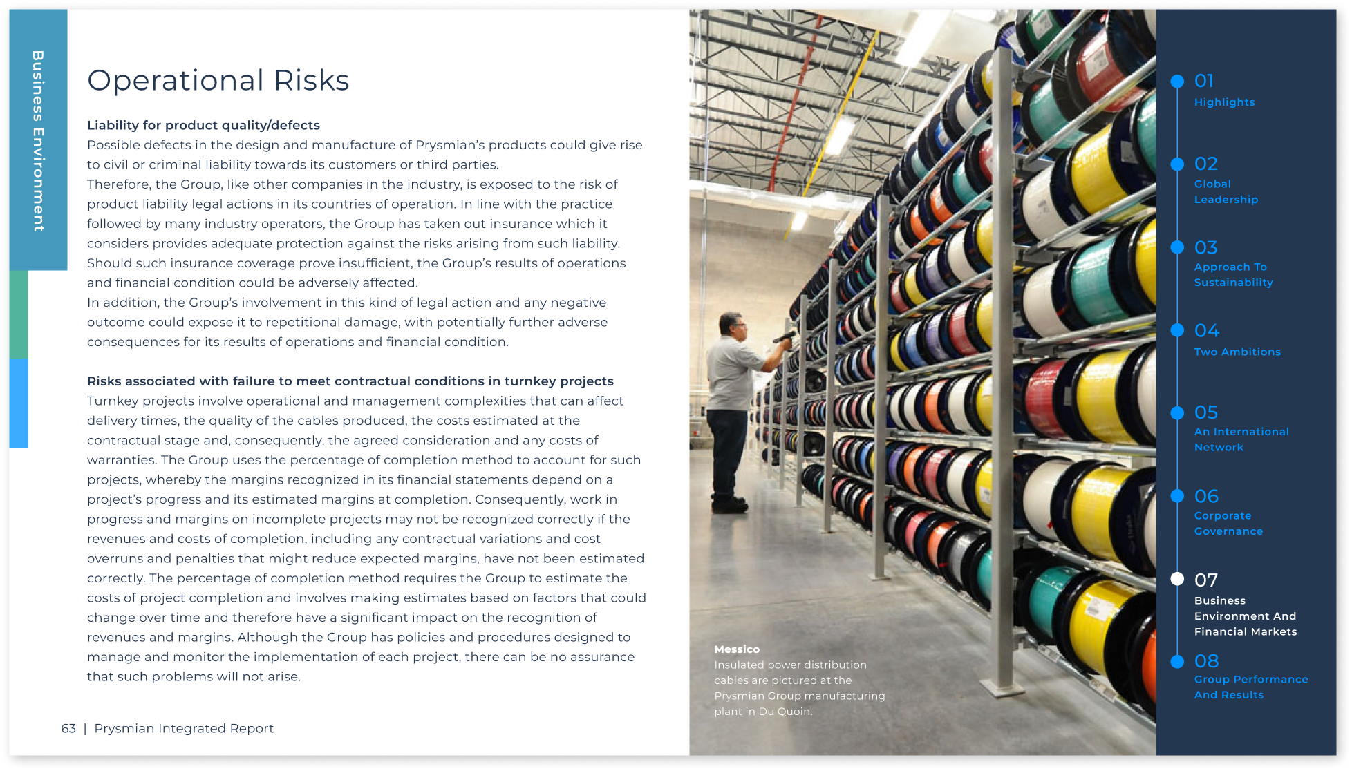
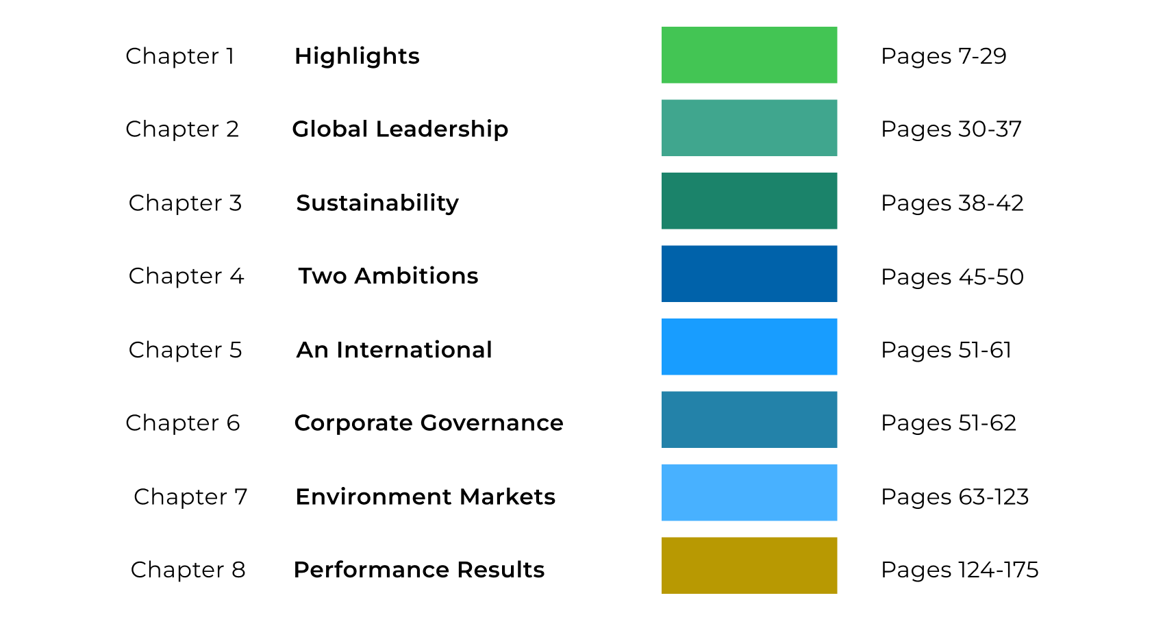
To solve the complexity of the 180-slide count, I moved away from a traditional linear presentation and engineered a Persistent Navigation Sidebar.
This case study is a representative sample based on real-world experience. All company names, data, and details have been modified for confidentiality.
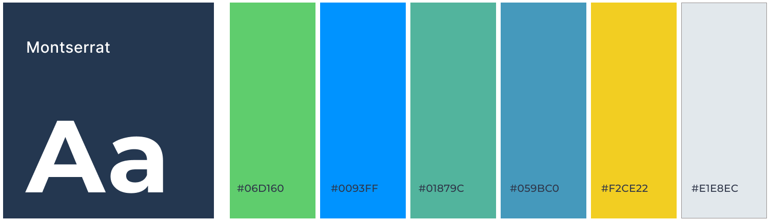
Visual Language & Design System
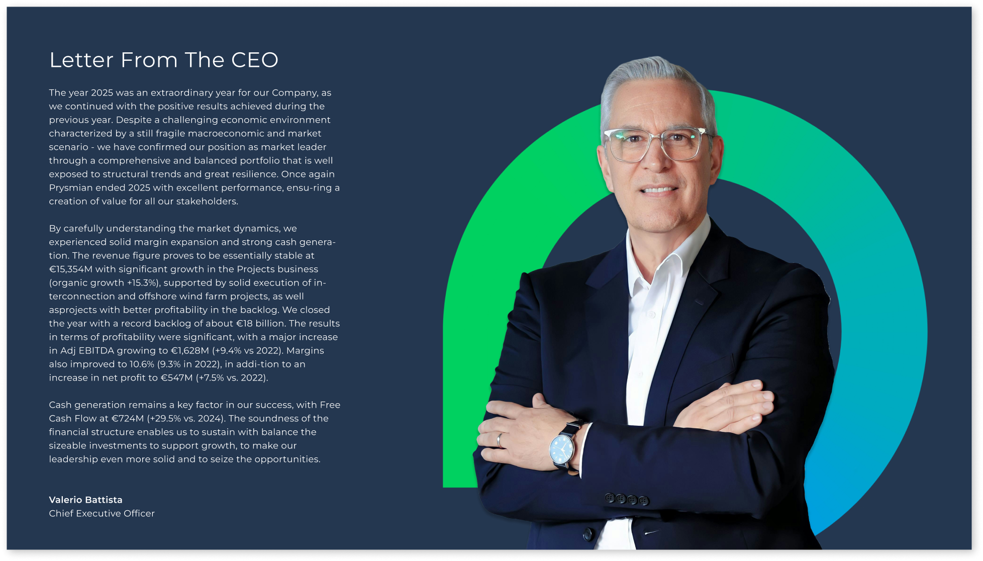
As this was an institutional report for a global firm, my role was to act as a Brand Steward—leveraging the company’s existing typeface and core color palette while engineering a new, high-performance visual system for 180+ slides.
Non-Linear Navigation Architecture:
Persistent Global Menu: To solve the complexity of the 180-page count, I developed a Persistent Global Menu on the right axis. This transforms the deck from a linear slideshow into a functional application, allowing investors to jump between chapters or return to the Executive Summary instantly.
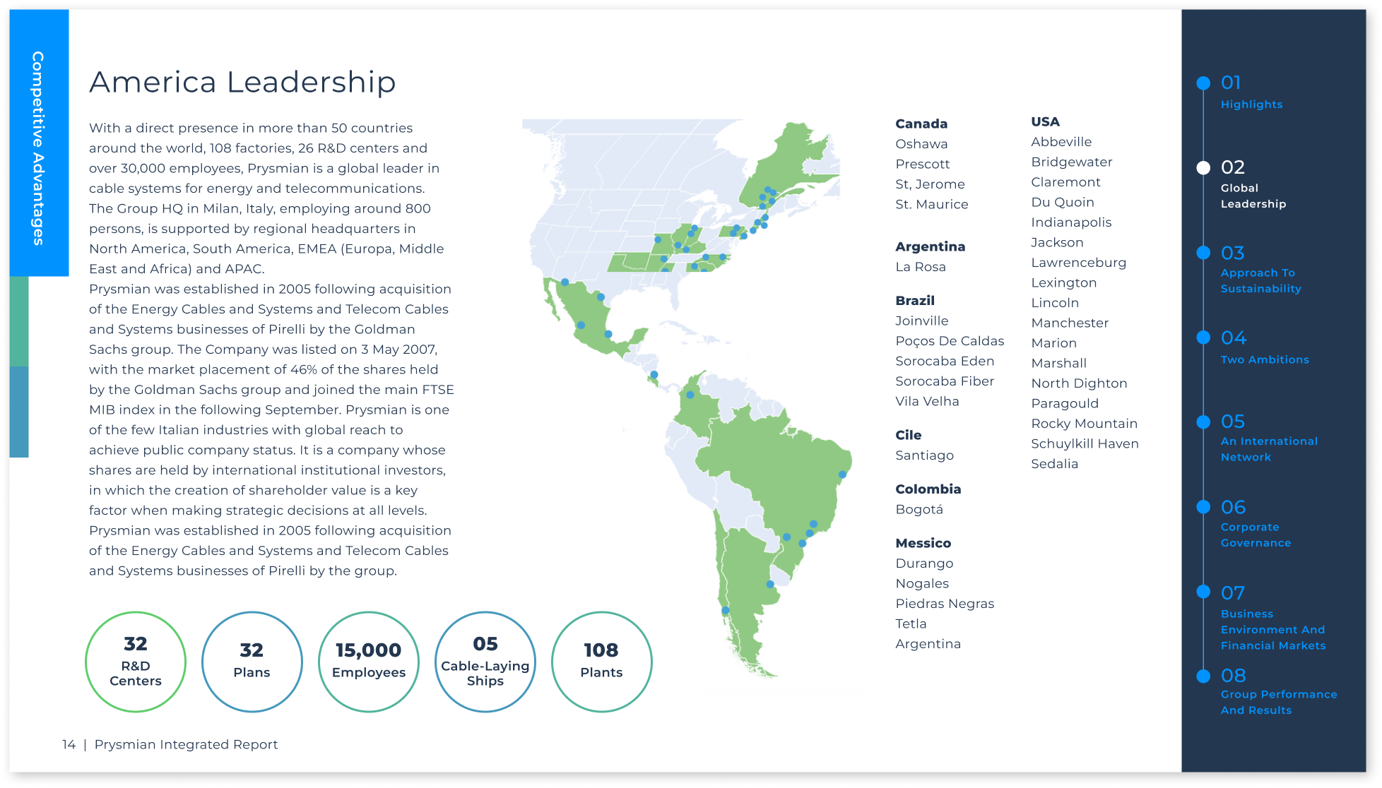
Visual Wayfinding System: "I established an 8-color taxonomy to provide immediate subconscious orientation; as users jump between data-heavy sections, the color shift signals a transition in the financial narrative
Technical Execution & Accessibility
System Architecture:
Widescreen Optimization: Designed in a 16:9 aspect ratio for seamless 4K boardroom projection and digital viewing.
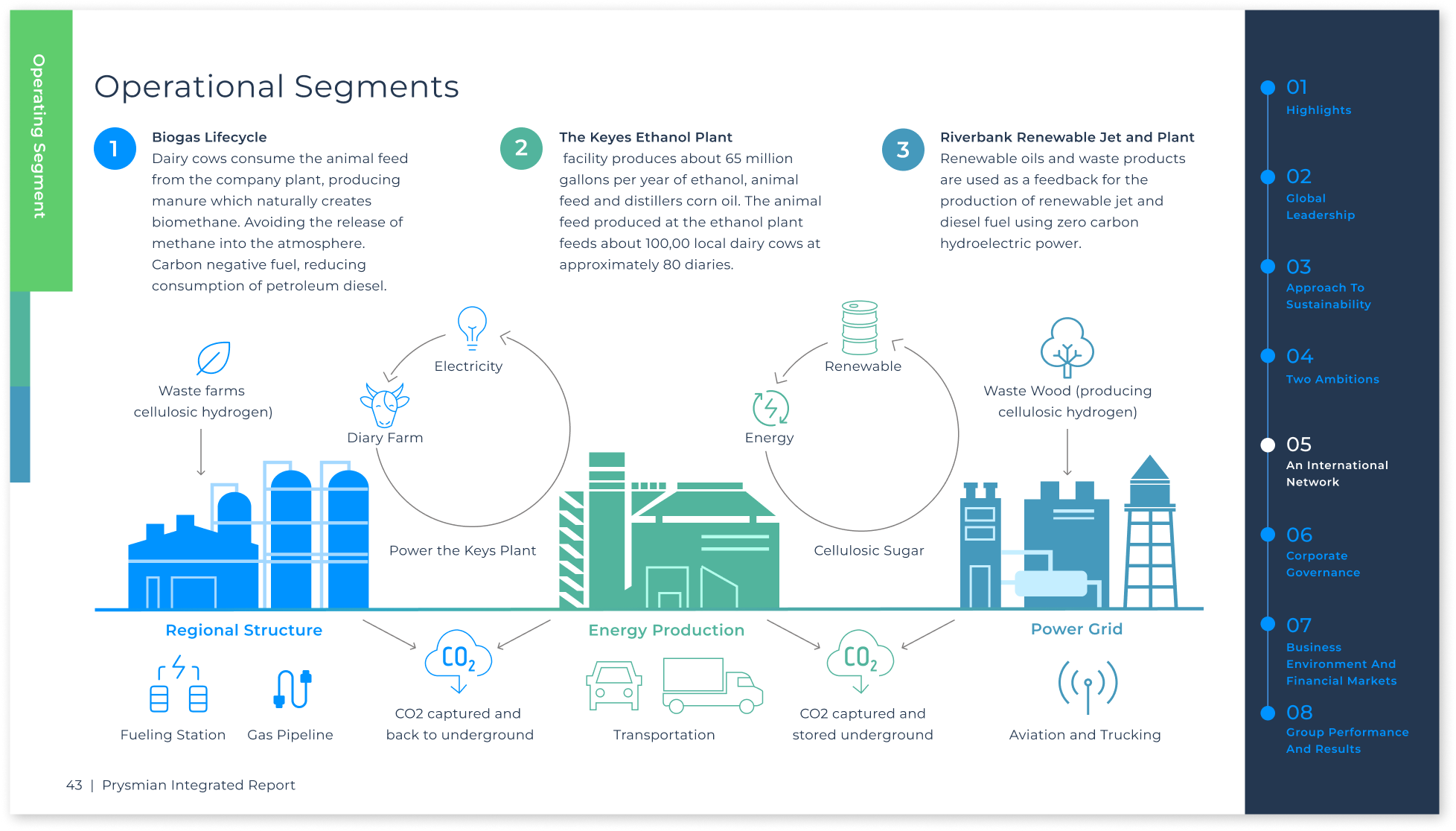
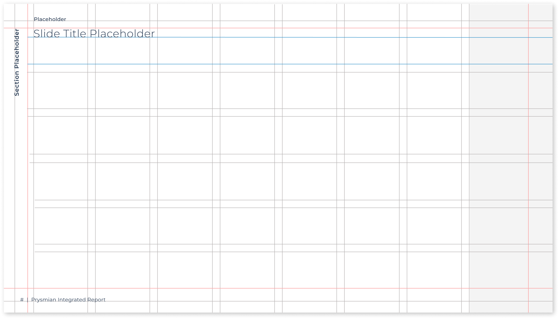
Modular Grid: Engineered a 8-column grid system to prioritize data legibility and prevent information density from overwhelming the investor's field of vision.
Legibility: Established an 18pt–20pt typographic baseline to ensure readability on mobile and tablet devices.
Color Compliance: Every chapter in the 8-color taxonomy was AAA/AA contrast-tested for accessibility and color-blind safety.
Impact
Fundraising Success: This interactive framework served as the primary communication tool for a successful $150M fundraising round.
Decision Velocity: The navigation system allowed investors to find specific data points independently and instantly, significantly reducing the volume of follow-up inquiries and accelerating the decision-making process for the banking team.